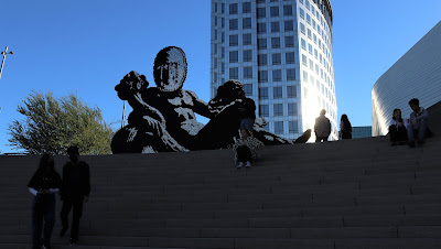
Approaching OCMA, Costa Mesa, CA.
NOTE: All pictures belong to my personal archives, please do not reproduce-share without my permission.
I have been a visitor of the Orange County Museum of Art since it was in Newport Beach, then it was moved to a provisory building in Costa Mesa, right in front of the Segerstrom Concert Hall.
Back in March 2019, I took some quick pictures of the mass model of the upcoming building, designed by Thom Mayne's studio Morphosis. I am happy to say I had the chance to talk to him in person long years ago, during an architectural exhibition in our FADU Faculty of Architecture and Urbanism of Buenos Aires. We briefly discussed a post graduate project designed by architect Luis Makianich and me. And he left us a very good impression, at least speaking about theory of architecture.
And once I emigrated to California, I had the opportunity to visit his building for Caltrans in Los Angeles and now the OCMA, which was inaugurated a few months ago.
My impression of the Caltrans building is barely mentioned in my post about Trees that Conform Social Space. I remember very well the lack of human scale while walking around the building, the heat in the cement plaza and the emptiness of the bar in the shadows, an intermediate space of multiple height were people did not want to stay (I questioned the employees). That imprinted in my mind that maybe our beloved Thom Mayne designed his buildings as objects, the morphology prevailing over the human scale and sensorial, human perception necessities.
My two pictures below are from 2009. The bar is in the dark left corner. People preferred stay in the plaza across the street, drinking a juice sold at the mobile stands, under the shadow of the welcoming trees.
An empty plaza with benches like sculptures, under 100F degree or more...
This picture shows how the side street offers a solid wall as a basement, see the scale compared to the men in the corner. Well, this is part of the main problem I see in Los Angeles, a city that has evolved for and with the cars. It is not pedestrian friendly.
The next pictures are cell phone snapshots of the OCMA building mass model, from 2009. Yesterday, I was wondering what was so "off" from the mass model to the final product.
Basically, the resolution of spaces is the same, but in a closer analysis, I have seen that the intersecting planes, have become undulating surfaces on which the straight lines in the massive model are materialized with thick rigid ceramics (!!), what is worse, the ceramics are installed in diagonals, in consequence, there are a lot of unsolved triangular cuts.
The upper undulating surface, I have taken this picture standing on the terrace. The red building behind is not part of OCMA.
A corner view, which looks OK. See how the ceramics change direction on the left and compare the photo with the mass model above.
Now, let us take a closer look at the joints. So obviously wrong and without care, to the expert eye. Besides, the joints have different thickness, due to them being forced to adapt to the shape.
A macro shot of the tile next to the Aluminum
The problem of the materials intersection is seen inside as well (precisely, the curve on the left), though I truly like how the light and volumes play at the entry hall.
This one is my favorite interior view, the dark ceiling extends above the longitudinal bar.
I believe the use of brick would have been better for this morphology, a prefab brick with the same or similar color. Because the continuity with the neighboring Pelli's Segerstrom building is kept without a doubt.
OCMA on the left and the Segerstrom Concert Hall on the right. Alike colors, and an impeccable resolution for the Segerstrom curved surfaces.
I took this picture for a colleague and friend at the University, so he can show it to the students, to learn that even the minor details should be solved.
I have had long conversations about this building with some colleagues today. Should we worry about minor details or should we enjoy the overall display of technology? Can we still praise the functional resolution, regardless the morphology, which a friend of mine calls "totally whimsical" ?.
I am in favor of "whimsical" new shapes that are allowed due to the advance of technology, but most of all due to us being accustomed to new images and sensorial spaces, for exampl, all those immersive "out of this world" experiences inside buildings like warehouses. I still remember when our students played with Zaha Hadid designs, and we warned them "remember, we need to build it!", the first GA magazine with Zaha Hadid projects that had no chance to be materialized, at the time, of course. So now, I feel like the architects have a sort of victory, while, of course, these "liberties" are allowed by the City planners, who are not architects but expert on zoning codes where politics are also at play. But this is another story.
OCMA galleries are an example of a revised Museum concept. The galleries are open to a common corridor and we can take a quick look at what is going on from afar, or turn around and be tempted to enter the gift shop, which is open as well, like at the Broad Museum in Los Angeles.


We can also have a preview from the upper galleries, through narrow openings on the white walls. Of course, it depends on your height. As I'm short, then I could take the following pictures, if your height is 6' or so, the narrow opening is below your line of sight, unless the staircase down is taken. The minor details: you will also see the dust accumulated on the free standing partition walls and the horizontal part of the wall beyond the columns, as no human arm can reach there to clean. Needless to say, the white walls next to the gallery stairs are stained already. A colleague's opinion was they should have been painted another color where the dust can't be noticed. I proposed a change of material, but the Minimalist white would have been lost.
Where you see the line of the glass, on the walking side it is clean, on the other side, there is dust.
If this picture is zoomed, there is a visible line of cleanliness vs dust. I extended my own arm to see how far I could reach to clean without an extended dust brush.
The sort of white Minimalism is extended to the bathroom stalls, and there it was where I had my surprise. I felt this weird sensation that I was inside a closet. The feeling of uneasiness made me choose the pull knob for handicap. I wanted to get out of this bathroom space as soon as possible. In the back of my brain, I recalled the horror movies with labs and dead frozen bodies. Too much of my imagination I suppose :)
The uneasiness is repeated outside, in the (empty again) terrace, when I reached the stairs or sort of theatre wide hemicycle where one can seat and view a narrow circulation to the side entry door, or just the street beyond. I expected a space to enjoy a performance, more like in the Getty Museum style, but not. And there is lack of middle handrails (of course, it is not a formal stair), so I stayed a while observing what people would do:
just take pictures facing the flat sculpture which is nonsense to be "walked around", sit for a few minutes on the upper stairs or close to the handrails on the sides. I had to avoid a couple in order to reach the handrail. I think nobody would venture to go downstairs taking the middle part of the it.
If we compare this pictures with the mass models, we'll notice the side guardrail which was meant to be glass was replaced by a solid high guardrail. The sculpture is meant to be seen from below, and the back has the just the braces painted alike. It is more a scenography than a 3D sculpture.
The empty terrace and the back of the flat sculpture.
The planter on the terrace. The row of trees on the side looks very good but sculptural. The planter seems to be like "we need a planter somewhere, given it's a barren terrace". Some people were sitting there, but there is no hope of future good shadow, just to see the species. A reminder of the Caltrans plaza?
Looking up from the ground plaza. The building on the left does not belong to the museum. What makes me think maybe complex morphology buildings should be erected on open spaces without any other building around. One may guess at first sight which building is which or part of.
The gift shop has this interesting "sculpture" which reflects the building and on the back contains glass cabinets for art products. I was astonished to see, a few rubber bands for hair pony tails, hardened in free standing curly shapes, were 45$ each one (!!).
A colleague that visited the museum with me found this tempered glass railing over the steps pretty funny and out of sense. We were doubting if this sculptural construction was finished or not. A climber would grow and cover all of it, I will have to come back to see if the climber would hide the guardrail, and then give an answer to my friend who asked, how much would you think it was the cost of the diagonal tempered glass? While I was looking at the climber trying to reach it.
A final consideration about the landscape. If the climber was meant to add some green area to the barren open space, then it is not significative. The plaza has a few trees, and the palm trees are part of the buildings across the street.
The row of trees, as seen in the massive model, are not to enjoy them from a practical and useful point of view. They are just like sculptures, one cannot step on the planters. There is also a physical barrier to the side garden, as seen from the terrace. I am against this design decision, since any architect can use the landscape as a mean of relax and healing. This decorative landscape is reinforcing the idea of the architecture as an object, pretty far form the users natural need of being in close contact with nature. Which is the consequence? People taking their beverages outside the building, looking for a plaza with canopy trees.
Regardless my personal opinion, the OCMA is worth the visit.
A row of trees dividing two buildings. No matter the effort, this space will be always empty, it is just a service corridor. The trees are planted where some space was left.


