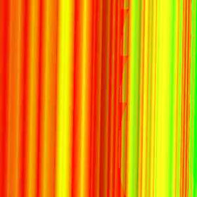
Textil 1.Fractal digital Art with stripes, by Myriam B. Mahiques
As time goes by, it is increasingly difficult to establish the boundaries between the arts and between the arts and sciences. A student of audiovisual design would categorize some superhero movies as "redundant special effects and editing cuts", a child would say that this film is a comic, in its format; the films directed by Peter Greenaway can be seen as plays, books, paintings exhibited in a museum. And architectural objects can be seen as works of art, urban design as both art and manifestations of physical science or mathematics research, based on scientific aspects which results derive from formulas where intuition or social issues do not always take place.
Maybe it is easier to relate sculpture with architecture, as seen in my previous post “Blurry frontiers between art and architecture”, because both of them are tridimensional, and we can also find some roots in collage. But relating optical art, post painterly abstraction, to a three dimension object, is not such an easy task.
By 1950, Abstract Expressionism was at the top of success. The idea was to articulate surfaces of the paintings as “fields”, rather than compose them: the canvas determined the pictorial structure, it was beyond painting. To activate the field, canvas were divided horizontally or vertically by band/s of color. The American artist Morris Louis took this concept to the limit, he worked with unsized canvas and soaked –more than painted- the fabric like dyed cloth, so it became a painting in itself. It was a clear rejection of cubism and sculptures.
Morris Louis painting. www.iu.edu/~ocmhp/062405/text/arts.shtml
Phantom Tattoo, by Jim Davis. blog.art-tistics.com/?m=200805
In 1960, some artists turned to brilliantly colored shaped works (diamonds, semi circles) that activated not the canvas, but the wall surface. There was then a period of experiments with paintings with stripes of different colors, followed by another period of shaped canvases fitted together in series to make serial compositions. The next step was asymmetrical canvases painted in vivid colors which segmented the shapes, some of which were curved. It developed into painted metal reliefs (stripes) attached to the background.
It is interesting to notice that while both Abstract Expressionism and Pop art triumphed in Europe, Post-painterly abstraction did not make an impact in the European scene. Europeans, specially British artists, were different from their colleagues in America in the fact that they remained fascinated by pictorial ambiguity, and continued to play with effects of depth and perspective, technique that was closer to an architectural drawing.
Julian Spalding, in his book “The Eclipse of Art: Tackling the Crisis in Art Today”, highly criticizes the use of such hard geometric patterns. On Bridget Riley’s works, he comments that her stripes “had been applied by a machine”….”Her lines were ruled; …masking tape was used to ensure that the edges were sharp. What had to be eliminated was any hint of human presense”. And then “But where does that lead? If a work of art is not centred on humanity, what is its form? Why stop at the edge of a canvas, when one could cover the whole wall?”.
Bridget Riley, optical art. RA2. http://nadav.harel.org.il/Bridget_Riley/
Now, with fractal art, we do not need the tapes, and yes, we do need a machine: the computer. The example below is a fractal I have generated from a Sierpinski triangle, and it looks incredibly as a composition of stripes.
Textil 3. Digital painting by Myriam B. Mahiques
Brandhorst Museum in Munich, southern Germany. See the composition of stripes makes the painting closer to a fractal design. Photograph: Matthias Schrader/AP
Spalding’s comment about covering the wall has found a response in Germany, in the Brandhorst Museum, Munich. Its painterly facades in geometric stripes of many colors make the building look like a gigantic abstract. Obviously, the Museum is a container for the displays of many contemporary paintings, sculptures and videos. The architecture is an advertisement of what is going on inside. As Jonathan Glancey puts it “This building is the servant of the art inside and not the master, as too many bravura new galleries today can be.” The Museum’s architect, Matthias Sauerbruch explains the façade’s idea was taken from the Neue Pinakothek, the Romanesque art gallery commissioned by the former king Lud Ludwig I of Bavaria in the 1850s. This monumental work, which stood near the Brandhorst, was destroyed by allied bombing during the second world war and has since been replaced by a postmodern building opened in 1981."The outside of Ludwig's building," says Sauerbruch, "was covered in what were effectively huge paintings. You knew it had to be an art gallery. It must have had a magnetic appeal: a building designed to attract a large public and to show them works collected by the Wittelsbach dynasty. We picked up the idea - but, well, inside our museum things are very different."(quoted by J. Glancey). Maybe Sauerbruch was inspired by the propagandistic idea, but I see his resolution goes beyond advertising, while the Neue Pinakothek exhibits the exterior paintings separetely, inside frames of pillasters, the whole Brandhorst Museum is a 3D painting in itself: the Abstract Expressionism has evolved into architecture.
Neue Pinakothek, 1880.reference.findtarget.com/.../Neue%20Pinakothek/
REFERENCES.
Do not adjust your art gallery. In Guardian.co.uk Article by Jonathan Glancey, The Guardian. Thursday 4, June 2009
Julian Spalding. The Eclipse of Art: Tackling the Crisis in Art Today. Prestel, 2003


new design .
ReplyDeleteI get well soon.