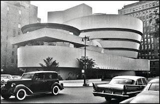
The Guggenheim Museum in the old times. Photo from The New Yorker
I´ve been lucky to visit this museum in 2005. Our minds are accustomed to see different type of buildings, mixed in the cities, but it must have been an urban shock 50 years ago. The avant garde design, in the middle of the classic city.
The Guggenheim is to be lived. When you walk down or up the ramp, you feel dizzy, and it was not only me, there was a young woman feeling terribly sick. The whole experience is unforgettable, since you see it while you walk through the sidewalks, it´s really impressive.
Last year, it was the 50th Aniversary since it was opened. And The New Yorker dedicated an article to this event. Let us read some excerpts:
In 1959, when the Guggenheim Museum opened, traffic on Fifth Avenue moved in both directions. As you drove northward, the bulbous form emerged from behind flat-fronted apartment buildings like a balloon in the Macy’s Thanksgiving Day Parade. I first saw the museum that way, as a nine-year-old, and the idea that this beguiling object had been created to display art, or that it might not be up to the task, seemed beside the point.
Fifty years later, it still does, even though the charge that the building upstages the art has become part of its legend. Staff at the Guggenheim like to refer to the building as the most important object in the museum’s collection, which makes it odd that the Guggenheim hasn’t had a major exhibition of Frank Lloyd Wright’s work until now. Its fiftieth-anniversary show also marks the recent completion of an extensive restoration of the building and the fiftieth anniversary of the death of its maddening, egotistical, duplicitous creator. Wright died, at ninety-one, in April, 1959, six months before the museum was finished. He last saw the building in January of that year, when he was photographed looking out from the spiral ramp with the contractor, George Cohen.
Notably absent from that picture was the museum’s director, James Johnson Sweeney, who fought with Wright over almost every aspect of the building. Once the architect was gone, Sweeney painted the interior white, instead of the ivory that Wright had wanted; rather than hang the paintings directly on the backward-sloping walls, where Wright wanted them to appear as if they were on artists’ easels, he installed them upright, on metal rods projecting from the walls. Over the years, the building has been pushed and pulled in all kinds of directions, rarely to its benefit. Taliesin Associated Architects, the inheritors of Wright’s practice, put up a garish addition behind the museum; later, it was demolished to make way for a limestone slab by Gwathmey Siegel, and a bookstore was stuck in the open space beside the rotunda. It’s wonderful now to see the Guggenheim at least a bit closer to its 1959 condition, the reinforced-concrete surface of the exterior smooth and voluptuous rather than cracked and shabby. Planters, complete with live plants, and a fountain that Wright installed in the rotunda are back in use. They’re hardly his most sophisticated gesture, but it’s pleasing that the Guggenheim resisted editing them out.
Wright envisaged the Guggenheim as “a curving wave that never breaks.” When it opened, John Canaday, in the Times, called it “a war between architecture and painting in which both come out badly maimed.” But Wright’s conception has always functioned better than its critics have admitted, if never as well as he himself predicted. Works of artists like Alexander Calder and Ellsworth Kelly play off well against the curves, but the space overwhelms anything small, delicate, or highly detailed. This makes the Guggenheim the progenitor of every architecturally assertive museum since, and beside works like Frank Gehry’s Guggenheim Bilbao or Daniel Libeskind’s glass-and-metal shards in Denver and Toronto, it now looks almost demure. What strikes you when you walk into Wright’s rotunda today is how intimate and comfortable its magnificence is. Art is none the worse for half a century of being seen here.
Reference
Spiralling Upward. By Paul Goldberger. The New Yorker, may 25, 2009

No comments:
Post a Comment