Arch. Myriam B. Mahiques Curriculum Vitae

Monday, November 29, 2010

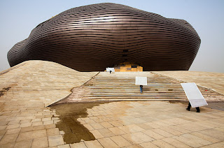
Museo Soumaya in Mexico City

Picture from wired.co.uk
¨In 2011, the Museo Soumaya in Mexico City will open its new building -- a 16,000 square metre facility designed by Fernando Romero from architectural firm LAR. The construction, which is pictured above, will house the second largest private collection of works by French sculptor Auguste Rodin in the world.
The museum, which was established in 1994 by the Carlos Slim foundation, is part of the city's redevelopment of an industrial zone dating from the 1940s. The contents will be spread over six floors, which also include an auditorium for 350 people, library, a restaurant, and a "multi-purpose gathering lounge", which probably just means a lobby.¨(...)
Keep on reading:
Museo Soumaya. From arqhys.com

Russia plans domed city in Siberian mine. By Duncan Geere

An article by Duncan Geere for Wired.co.UK:
A Russian construction company called AB Elise hopes to build a gigantic domed city in an abandoned diamond mine in Siberia, powered by the sun. The project is more of a concept than a reality so far, but the plans show accomodation for 100,000 people over three main levels.
The mine in question is the Mir mine in the Mirniy industrial zone in Eastern Siberia. You might have probably seen photos of it before, labelled "the largest man-made hole on earth" or something similar. It's long been used to mine diamonds, but the mining stopped in June 2001, replaced with a network of underground tunnels below. Presumably this activity would have to cease if the structure is ever built.
The project, which is described in a series of slides on AB Elise's site, is split between three levels, penetrated in the centre by a vertical farm and forests. Around the exterior are residences and recreational areas, and there's also a research centre in the plans.
However, it might be a tricky construction project -- the climate of the region isn't welcoming -- the ground is permafrost for seven months of the year, and becomes sludge in the summer. Surrounding buildings are mounted on piles so they don't sink. In the winter, temperatures in the area drop down to around -40 degrees celsius.
What the region does have, on the other hand, is plenty of sun, so the roof of the structure would comprise of solar panels to power the heating and electricity needs of the resident population. The idea is to attract more residents to the area, which is one of the most sparsely populated regions in the world -- with only three people per square kilometre.

Friday, November 26, 2010

Testing hurricane homes

Two homes tested, one remains
At the Institute for Business & Home Safety's grand opening of its multi-risk building science research center, a conventional building and one meeting the IBHS Fortified standards were tested with hurricane-force winds on October 19, 2010.

A green future for Brooklyn-Queens Expressway trench

Connections. Picture by Starr Whitehouse Landscape Archs.
Green Canopy. Picture by Starr Whitehouse Landscape Archs.
Maximum Green. Picture by Starr Whitehouse Landscape Archs.
¨The proposals (..... will)) decide the future of the Brooklyn-Queens Expressway trench which severs the Carroll Gardens, Cobble Hill, and Columbia Street Waterfront neighborhoods of Brooklyn. Residents spoke up and prioritized their wishes for a less disruptive BQE including reduced noise and pollution, increased neighborhood connectivity and bike / pedestrian safety, and an overall greener streetscape.
In short, the BQE is going green, or at least as green as a pollution-spewing six-lane highway can be. Luckily the NYC EDC, NYC DOT, and Starr Whitehouse Landscape Architects have come up with three compelling design solutions to improve the area.¨
REFERENCE
Posted by Branden Klayko

Thursday, November 25, 2010

Happy Thanksgiving!


Happy Thanksgiving for everybody in USA!!!!!! My contribution of digital paintings for a peaceful day.

Monday, November 22, 2010

The ultimate destiny of the Harmon Hotel in Las Vegas

Picture downloaded from lasvegasun.com
That´s a very bad story based on a building designed by arch. Lord Norman Foster. So many problems in the construction, and Building  And Safety inspectors are not approving the installation of rebars.
In consequence, the building should be shrinked or imploded. I´m so sorry to learn about it, after approximately one year of lawsuit.
¨Let´s see an excerpt from lasvegassun.com almost a year ago:
What if they had shorted the Empire State Building by a couple of football fields?
Or gave the Great Pyramid a flattop? Or built the Eiffel Platform?
Size certainly isn’t everything when it comes to buildings, of course. But the impact of many iconic structures is in their sheer stature. That is why it’s so startling — disappointing, even — that the Harmon hotel, CityCenter’s gateway to the Las Vegas Strip, has suddenly been cut down to about half its intended size.
Topping out at 28 stories instead of the proposed 49, the incredible shrinking Harmon seems unfortunately fated to look like a stubby, squashed stepchild next to its soaring CityCenter siblings, the 61-story Aria Resort & Casino and the 57-story Vdara condo-hotel.
That is the result of construction flaws — 15 floors of wrongly installed rebar — that forced MGM Mirage, which is developing the project with Dubai World, to rapidly call for a significant reduction of the nongaming boutique hotel. MGM Mirage canceled the Harmon’s 207-unit condominium component — the top half of the building — and postponed the opening of the hotel to late 2010.¨
Now, read the what´s going on in November 2010, from Las Vegas Review-Journal:
¨MGM Resorts officials, very quietly and with no public fanfare, want to demolish the unopened 27-story Harmon Hotel -- one of the components of its $8.5 billion CityCenter development.
But litigation and pinpointing blame for the troubled building will prevent anything from happening to the unfinished tower until late 2012.
In its recent third-quarter earnings statement, MGM Resorts said it took a $279 million noncash impairment charge for the Harmon and concluded "it is unlikely the Harmon will be completed using the building as it now stands."
MGM Resorts International operates CityCenter in a 50-50 joint venture with Dubai World.
In an interview this week, CityCenter Chief Executive Officer Bobby Baldwin said the company has hired two sets of structural engineers to determine the building's condition and what steps might be taken. MGM Resorts will bring in a third group of experts to analyze the building.
A report on the findings will be filed with the Clark County District Court, as part of CityCenter's lawsuit against Perini Building Co., the project's general contractor.
Perini will also be allowed to hire structural experts to assess the Harmon.
"Right now, I have a building I can't do anything with," said Baldwin, adding that Harmon has become "the poster child for nonconforming work worldwide."
Clark County Building Department officials will not allow any construction to be done to the Harmon, which was originally designed as a 47-story hotel and condominium tower.
In 2008, inspectors found structural work on the Harmon did not match building plans submitted to the county. The construction issues involved improperly placed steel reinforcing bar, commonly known as rebar.¨

Sunday, November 21, 2010

A look at contemporary Berlin through the pictures of Frank Schirrmeister

Frank Schirrmeister is a photographer who lives in Berlin. These pictures are from his series ´Plain City¨.
¨Plain City is an attempt to keep hold of something, to retain or preserve a particular vision of Berlin, whose only constant is constant change. Berlin today is deemed the trendsetting city in Europe. Due to clever marketing and low-budget airlines, it is known around the world as "the place to be." As someone who was born in Berlin, I find it difficult to keep pace emotionally as the city reinvents itself with dizzying speed. I often have the feeling that my own city doesn't belong to me anymore, but to the forces of the global economy. When photographing Berlin, I am constantly trying to scrutinize and to challenge the popular image of the city. I explore the town beyond the facade, delve into the deeper layers of the metropolis.¨
All pictures by Frank Schirrmeister.


Keep on looking

The narrative of St. Bartholomew Roman Catholic Church

St. Bartholomew Roman Catholic Church. PHOTO: Jeff Goldberg for Esto
Architect William A. Browne, Jr. explains how he and his firm use narrative when designing buildings and spaces:
¨Columbus, Indiana – a community of less than 40,000 – has put its mark on architecture like no other community of its size. The city is ranked sixth in the nation for architectural innovation and design by the American Institute of Architects on a list that includes Chicago, New York, Boston, San Francisco and Washington, D.C. Championed by Cummins Engine entrepreneur J. Irwin Miller, since 1941 this community has constructed more than 70 buildings and pieces of public art by internationally-noted architects and artists, including I.M. Pei, Eliel Saarinen and his son Eero Saarinen, Richard Meier, Harry Weese, Dale Chihuly and Henry Moore. The most revered of the commissions are the churches, so when we were selected to design the St. Bartholomew Roman Catholic Church, it was a heaven-sent opportunity.
Reinterpreting the seven days of creation, the design for the church begins with a simple story that reflects the ecclesiastical function of the building, as well as the Catholic faith's sacred and distinct symbols. The church’s design unfolds from its core, (1) beginning with the crucifix and the tabernacle. The altar's placement (2) is inspired by the Vatican II doctrines that bring the congregation closer to it. From this design, a nautilus configuration emerges, representing God and the perfect shape of nature. The tower and roof structure (3) reaches up toward heaven, acting not only as the church’s structural support but also as its spiritual support housing the tabernacle. The roof structure then uniquely spirals downward with the curves of the nautilus-shaped walls. Two large triangular stained glass windows, are created on the north and east walls. The baptistery's placement (4) is located in front of the main entry to the worship space, in reference to the Catholic tradition of touching holy water before entering. Traditionally, the historic narthex (5) was the entry room to the worship space, however; the modern use has adapted to a social gathering space before and after worship. Its square shape represents man's perfect shape. The sacristy, the vestry, and the nursery (6), along with restrooms and coatrooms, provide the support for the times of worship, completing the buildings functions. With this final step, the church’s design is completed (7), marking that the seventh day is for worship.¨

Friday, November 19, 2010

Berlusconi y la ¨restauración¨ de las estatuas de Venus y Marte


Fotos bajadas de eluniversal.mx
A esta hora del día, creo que esta ya no es más noticia, todos los diarios, la red, están comentando sobre la decisión del primer ministro de Italia, Silvio Berlusconi, de completar las estatuas de Venus y Marte en la casa de gobierno.
No soy experta en Preservación y Reciclaje, pero sí hice una materia electiva y un par de cursos de postgrado. O sea, algo aprendí. Y lo más importante es el respeto por la obra original, trátese de una estatua, un cuadro, un edificio, ornamento, etc. En ese sentido, hay una diferencia, entre Preservación y Reciclaje. Se puede hacer obras de preservación para que la pieza no decaiga, un trabajo absolutamente concienzudo y/o un reciclaje y completar las piezas faltantes, pero esto implica mostrar al público qué ha agregado el restaurador y no pertenece a la obra original. En otras palabras, mostrar los elementos que no son parte de su ¨esencia¨ o su ¨espíritu¨. Es por esto que se emplea un material altamente contrastante, en color y textura, un ejemplo cualquiera que aplicará o no según los expertos, -pero valga para este post-, acrílico y piedra.
Es insólita la decisión del Primer Ministro italiano, y, en defensa de la admirable cultura de su país, hasta diría vergonzosa. Debajo, la reproducción del artículo del diario argentino La Nación, sección Cultura:
¨ROMA.- A pesar de las estrictas reglas de restauración en Italia, el primer ministro Silvio Berlusconi ordenó "completar" por su cuenta dos estatuas del 175 d.C. que decoran la sede del gobierno en Roma, lo que generó una ola de reacciones indignadas.
El jefe de gobierno dispuso la colocación del pene y las manos a la estatua de mármol de Marte del siglo II y las manos a la de Venus, partes que se habían perdido por el paso del tiempo.
Las hermosas estatuas, de más de 2 metros de altura, prestadas por un importante museo romano, fueron instaladas en el patio de honor del Palazzo Chigi a pedido del jefe de gobierno y magnate de las comunicaciones, quien las hizo colocar delante de un discutible telón azul ideado por su arquitecto personal, Mario Catalano.
Las estatuas fueron descubiertas en Ostia, cerca de Roma, en 1918 y representan al dios de la guerra y a la diosa del amor con los rostros del emperador romano Marco Aurelio y su esposa Faustina.
El préstamo de las estatuas, concedido a comienzos de año, había generado ya una polémica, debido a que se trata de algo inusual en un país que protege su enorme patrimonio arqueológico, cuenta con expertos de renombre mundial especializados en restauración y conservación y aplica leyes que son un ejemplo para los demás países.
La llamada "cirugía estética" a la que fueron sometidas las estatuas viola también las reglas de conservación para piezas de valor histórico, para las cuales se prohíbe que se engañe al espectador y se deben evidenciar los pedazos originales y aquellos restaurados.
"¿Por qué las esculturas en China parecen todas nuevas y a las nuestras les faltan brazos y cabezas?", preguntó Berlusconi a su arquitecto cuando decidió que fueran completadas, según informó el diario La Repubblica.
El controvertido "lifting" y su costo (70.000 euros) fueron criticados también por haber sido decididos justo cuando el Ministerio de Cultura registra recortes drásticos de fondos (de un 46 por ciento para 2011) y tras el grave derrumbe del Duomo de los Gladiadores en el parque arqueológico de Pompeya, entre las mayores atracciones de Italia. La política de austeridad alcanza la tutela del patrimonio artístico italiano.
Según La Repubblica , el dinero gastado en las estatuas podría haber sido utilizado para intervenciones de máxima urgencia.
Para la mayor formación de izquierda, el Partido Democrático, el ministro de Cultura, Sandro Bondi, se ha plegado "a los caprichos y manías" del premier. "Que explique si es normal que se violen las normas vigentes y se someta a cirugía estética a ese grupo de estatuas de mármol", declaró la encargada de cultura del PD, Manuela Ghizzoni.
Por su parte, el arquitecto Catalano justificó su intervención: "Son prótesis removibles que sirven para admirar la belleza de la obra tal como cuando fue esculpida", aseguró.¨

Wednesday, November 17, 2010

El Museo Nacional de los Niños de Pelli Clarke Pelli. Washington

Foto perteneciente al estudio Pelli Clarke Pelli
Del artículo de Rafael Mathus Ruiz para la Nación:
NUEVA YORK.- "Lo diseñé con la idea de que fuera algo adonde me hubiera gustado ir cuando era chico. Ojalá hubiera habido algo así en Tucumán. No había nada que se le pareciera."
Así resume el arquitecto argentino César Pelli el motivo que lo inspiró para dar forma, primero en el papel, al nuevo edificio del Museo Nacional de los Niños, que se construirá en National Harbor, cerca de Washington.
Más allá del goce inherente a la fantasía, Pelli reconoce, durante una entrevista con La Nacion, que viajar al pasado fue una tarea ciertamente compleja. "No es nada fácil ponerse de nuevo en la mente de un chico de 7 años. Es mucho más difícil de lo que parece. Hay que hacer un gran esfuerzo para recapturar cosas que se perdieron hace mucho. Es interesante la prueba. No pasa así nomás, pruébelo y se va a dar cuenta de que uno se ha olvidado casi plenamente lo que era tener 7 años", desafía.
Foto perteneciente a Pelli Clarke Pelli
Inaugurado en 1974, el Museo Nacional de los Niños tiene como misión primordial inspirar a los pequeños a preocuparse por el mundo y "tratar de mejorarlo". El museo planea mudarse al edificio diseñado por Pelli en 2013, cuando el nuevo centro cultural y educativo, que según se espera atraerá unos 600.000 visitantes al año, esté terminado.
"Este proyecto fue muy divertido, y el cliente fue fantástico, muy claro, expresó muy bien lo que quería. Nos dio un gran apoyo en las ideas que propusimos. Tuvimos muy pocas dificultades. Eso fue importantísimo", dijo Pelli, considerado uno de los arquitectos más influyentes del mundo por obras como el World Financial Center, en esta ciudad, y las torres Petronas, en Kuala Lumpur.
Luz y colores
El arquitecto también se refirió al lugar donde se levantará el museo y dio detalles del proyecto. "Estamos muy contentos con el terreno, que nos permitió diseñar un edificio libre, con mucha luz. Hemos diseñado seis alas, todas unidas, de colores, formas y materiales diferentes. El museo es un poco como lo podría concebir un niño, creo que va a tener una buena respuesta en ellos", apuntó.
Con un costo cercano a los 200 millones de dólares en un espacio de casi 14.000 metros cuadrados, el museo tendrá un espacio para juegos al aire libre y exposiciones que resaltarán las seis áreas de contenido básico -el medio ambiente, la salud y el bienestar, el juego, el compromiso cívico, las artes y las culturas del mundo-, creadas por tres firmas de diseño: Amaze Design, Roto Studios, y Aldrich Pears.
Pelli enfatizó la idea de vincular a los niños con el ambiente y que se sientan miembros de la comunidad global y protectores de la naturaleza.
El arquitecto se refirió también al desafío de seducir a un niño en la era de Internet y los juegos electrónicos. "No es un museo en el sentido común. Es un lugar de educación y entretenimiento. Va a depender mucho de los docentes. Va a haber gente para guiar a los chicos. Tiene un propósito educacional. Muchas de las cosas que están siendo exhibidas son interactivas. Los chicos tienen que hacerlas andar. Son todos elementos en que los chicos tienen que participar", señaló.
Pese a sus pergaminos, Pelli debió enfrentar, como todos sus colegas, los avatares de la crisis financiera global. "El año pasado fue difícil para nosotros. Este año hemos reemplazado gente y hemos tenido más trabajo. Pero en 2009 teníamos dos proyectos grandes en Dubai, que desaparecieron. Hemos vuelto al nivel que teníamos antes de la crisis. Nosotros ya nos hemos recuperado. Pero sé que hay otras firmas que siguen sufriendo", concluyó.
Lea otra nota al respecto:

National Children's Museum by Pelli Clarke Pelli Architects

From The Washington Post, an article by Jacqueline Trescott:
The National Children's Museum, a local institution without a home for five years, today will unveil the design by acclaimed architect Cesar Pelli for its permanent location near the Potomac River.
The museum, scheduled to open in 2013 at National Harbor in Prince George's County, is also opening a sneak-preview center, called the Launch Zone, at the harbor complex this week and introducing a redesigned Web site, http://www.ncm.museum, that officials say will allow future visitors to have a say about the museum -- from building materials to exhibits to games.
The planned structure is a four-story building with a glass atrium on one corner, a towering wind turbine, a wall of living plants along one exterior side and an interior open courtyard. Other features will include a slip on one of the Potomac piers with science and boating activities, and a gathering place in a nearby woodland.
But before this vision can be realized, there's the price -- $182.6 million -- that must be raised during a difficult time for many arts organizations due to declining endowments, streamlined public money, and decreased individual and corporate giving.
The starting point for the capital campaign was the $26 million from the sale of the museum's old property on Capitol Hill. Developer Milton Peterson donated the land, and the museum has received $7 million from the state. And museum organizers are confident they will reach their goal.
"This is a tough economic time. But we believe in the project and we have great leadership," says Kathy Southern, the president of the museum. "We are being very careful about how we use the money." All expenses are coming out of the fundraising, which currently is in the unannounced, quiet phase; Southern declined to say how much has been raised.
The museum, formerly known as the Capital Children's Museum, operated for 30 years and closed in 2004. Its previous location -- a rambling former convent at Third and H streets NE -- would have been too expensive to upgrade and modernize: "There was one winter where I wore mittens when I used the computer," recalls Southern.
As a museum "without walls," it has organized traveling exhibitions and demonstrations in classrooms, as well as participating in the White House Easter Egg Roll and the Cherry Blossom Festival.
Officials at the museum, which Congress declared a national museum in 2003, say that breathing room gave the founders and designers time to develop a framework for what the 21st-century patron wants.
"We are putting together the traditional role of a museum, along with a place where [children] can be helped to make a difference," says Southern. "We heard from kids that they wanted to be involved in their communities but had to find out how to do it. We surveyed 7- to 13-year-olds, the top part of our target, and 90 percent said they wanted to volunteer. But yet only one-third of those surveyed do it," says Southern, who was the start-up executive for Port Discovery in Baltimore and former executive director of James Madison's Montpelier.
Rather than organize projects, Southern says, the museum will show students the way through stories of volunteerism -- for example, efforts to recycle old bikes and send them to foreign countries, or a street-cleaning project that children can duplicate in their own communities -- will be outlined.
The 2,700-square-foot preview space will focus on the environment. The eventual museum will revolve around topics including the environment, civic engagement, play, health, the arts and the global neighborhood. Admission was $6 at the old museum. Southern says they plan to charge admission again: "We are waiting until we are closer to opening and then see what the market demands," she says.
Pelli, a winner of the American Institute of Architects' Gold Medal and the senior principal of Pelli Clarke Pelli Architects, has been associated with the project for years. He designed the space twice, once for a building-locked area at L'Enfant Plaza that didn't materialize because of a change in that renovation's timeline and plans.
The National Harbor site, Pelli says by phone, "gave us more room to do a better building. It is much more suited to accomplish more for children."
The courtyard is "the heart of the building," he says. Arranged around the courtyard are the other spaces for exhibitions, classrooms, stores and snacks. The design for the glass atrium includes a tower of children's photographs, some of which will be taken in real time of the day's visitors.
This is the first children's museum for Pelli's firm, and the architect says he wanted to emphasize all approaches to education and make the building itself a teaching tool. "We wanted to develop the building to teach in a non-structured way. Children should be immersed, not always sitting at a desk with homework," he says. "The wind turbine should be a delightful, education element. It is light and energy and should teach children about the problems we are facing in the world."
Up to this point, Pelli's most visible contribution to the Washington skyline has been the extension of Reagan National Airport. He also designed an office building at 1900 K St. NW and renovated another one at 15th and K streets NW.
http://www.washingtonpost.com/wp-dyn/content/article/2009/04/21/AR2009042103805.html

Sunday, November 14, 2010

Paul Rudolph: Lower Manhattan Expressway Exhibition

Picture from newyorker.com
Excerpt from Paul Goldberger´s post at The Newyorker:
¨It’s hard to say what the exhibition “Paul Rudolph: Lower Manhattan Expressway,” on view until November 20th at Cooper Union and sponsored by the Drawing Center, will do to Rudolph’s reputation. Back in 1967, Rudolph was commissioned by the Ford Foundation to study the implications of the Lower Manhattan Expressway, Robert Moses’s project for a Y-shaped highway that would have tied the Holland Tunnel to the Williamsburg Bridge and the Manhattan Bridge. The expressway would have destroyed much of what we now know as SoHo and Tribeca, which could not have evolved as they did had the highway been built. I am not sure it is possible to find anyone who regrets that this project never happened. (It was finally cancelled officially in 1971, after years of debate.) In 1967, presuming that the expressway was a done deal, Rudolph didn’t oppose it in the manner of Jane Jacobs, whose argument that it would have brought far more urban destruction than urban renewal ultimately carried the day. Instead, he took on the challenge of figuring out how to mitigate the highway’s impact on the city, and turn this incursion into something positive.
Picture from newyorker.com
Picture from cooper.edu
Rudolph’s idea, in effect, was to double down on the intervention, to build so much around and atop and beside it that the expressway would seem almost irrelevant. Rudolph envisioned what was, in effect, a megastructure extending all the way across Manhattan—a whole series of buildings that stretched, nearly unbroken, from river to river. Some of them straddled the expressway, others were towers arranged in clusters, and still others were in the form of slabs that Rudolph placed along the approaches to both bridges, turning them into walled corridors. He designed many of the buildings as gigantic frames to hold prefabricated apartment units that were to have been slipped into the structures. There were “people movers,” gliding along tracks connecting the buildings, and several floors of open automobile storage at the base of many of the apartment towers.
It was ridiculous in some ways, a futuristic city of the absurd. It ignored the streets, the lifeblood of New York’s urbanism, in favor what seems today like a brave new world of anti-urbanism. Rudolph himself saw this not as anti-urban, and contrasted his approach with that of Le Corbusier, who wanted to level the existing city and erect vast towers in open space¨.
Read the full article:

Paul Rudolph: Lower Manhattan Expressway 
October 1 - November 20, 2010
Arthur A. Houghton Jr. Gallery, The Cooper Union
Opening Reception: Thursday, September 30, 6:00-8:00pm

For further information and images, please contact: Emily Gaynor Public Relations and Marketing Officer
212 219 2166 x119 | egaynor@drawingcenter.org

Saturday, November 13, 2010

Pompeya en grave peligro

Pompeya. Foto de La Nacion.com
Reproducción del artículo de Elisabetta Piqué para el diario La Nación:
POMPEYA.- "¡Señorita, no puede sacar fotos!" La advertencia llega de boca de un custodio, mientras recoge pedazos de revoque recién caídos sobre un espléndido mosaico de la Casa del Fauno, la más grande de Pompeya, uno de los sitios arqueológicos más importantes del mundo.
La escena es emblemática. Sirve para entender que no es una metáfora que Pompeya, patrimonio de la humanidad, se está cayendo a pedazos, drama que viven también otros sitios culturales de Italia que están en peligro, desde el Coliseo y la zona del Palatino, en Roma, hasta conventos e iglesias.
Pompeya, la ciudad que el 24 de agosto de 79 d.C. quedó sepultada por la erupción del volcán Vesubio, al sur de Nápoles, y fue redescubierta en 1748, volvió al centro de la atención mundial hace una semana. La Casa de los Gladiadores ?también llamada Schola Armaturarum? quedó reducida a escombros, lo que fue definido como una tragedia anunciada y una "vergüenza para Italia", según clamó el presidente Giorgio Napolitano. Era el club donde se reunían los gladiadores después de la lucha y donde se sacaban las armas, entre trofeos, nichos y frescos que, después de casi 2000 años, difícilmente podrán volver a verse.
La Casa de los Gladiadores había resistido a la lava, a los bombardeos de la Segunda Guerra Mundial, a los terremotos, pero no al abandono y a la desidia, según acusan ahora los expertos, que piden la cabeza de Sandro Bondi, ministro de Bienes Culturales del gobierno de Silvio Berlusconi. La explicación oficial es que el derrumbe se debió a filtraciones de agua de lluvias y a errores en una restauración realizada con hormigón armado, en 1946. Pero expertos, arqueólogos, restauradores y diversos grupos que intentan salvar el precioso patrimonio artístico de Italia coinciden en que el desastre de Pompeya tiene que ver con un sistema "enfermo" de hacer política.
"Hace dos años, el gobierno de Berlusconi decidió poner a Pompeya dentro de la órbita de la Protección Civil, que normalmente se ocupa de terremotos, inundaciones y desastres. Pero en Pompeya no había ninguna emergencia. Fue una forma de poder gastar dinero sin necesidad de controles", denuncia ante La Nacion Tsao Cevoli, presidente de la Asociación Nacional de Arqueología (ANA). Protección Civil, además, es investigada por corrupción en las obras para la cumbre del G-8 realizada en 2008.
"Había diversos proyectos de manutención y conservación del área, con diversas prioridades, que fueron descartados porque tenían presupuestos bajos: es decir, no había negocio. En su lugar, se hicieron proyectos millonarios para que Pompeya se convirtiera en Disneylandia, proyectos con los que lucraron los amigos de Berlusconi, que no tuvieron en cuenta la historia de este sitio único, ni sus prioridades", agrega.
Como ejemplo, Cevoli mostró el antiguo Teatro Grande, prácticamente reconstruido para que pudiera hospedar en verano grandes conciertos, con una operación de marketing exitosa, pero con un trabajo de restauración duramente cuestionado. "Los trabajos de restauración tienen que respetar lo antiguo. De lo contrario, es un parque de diversiones... En Italia no se hacen trabajos de restauración para arreglar los monumentos, sino para gastar plata pública", acusa Cevoli, que se refirió luego a lo sucedido con la Casa de los Gladiadores, inaccesible y vallada debido al derrumbe. "¿Les echan la culpa a las lluvias? Acá llueve desde que desenterraron Pompeya, hace más de 260 años. El problema fue que no tuvieron en cuenta las prioridades y se ocuparon de los grandes eventos, de la imagen... Si tenés un familiar enfermo, ¿llamás a un médico o a un peluquero?", pregunta.
"Debajo de todo esto, hay una lucha política por la privatización de Pompeya, que siempre fue fuente de clientelismo político y tiene gran visibilidad mediática a nivel político", lamenta Biagio De Felice, arquitecto y técnico de la Superintendencia de Pompeya. "Pero no se puede privatizar algo tan emblemático... Es un problema cultural, porque si un gobierno no pone la cultura como prioridad, es un desastre", agrega.
Imagen de viaje-turismo.com
Cuerpos cubiertos por la lava y cenizas. Imagen de italiaguia.com
Una calle de Pompeya. Imagen de pasaporteblog.com/
Fresco en Pompeya. Imagen de culturaclasica.com
Pero el derrumbe de la Casa de los Gladiadores es sólo la punta de un iceberg. Una amplia lista elaborada por la ANA de los monumentos en riesgo incluyó, entre los conocidos, el Coliseo y la Domus Aurea de Nerón ?que recientemente también sufrieron derrumbes?, así como la zona arqueológica del Palatino, en Roma. También se encuentran en peligro las dos famosas torres de Bolonia, la espectacular cúpula de la iglesia de Santa María del Fiore y el convento de Santa Ursula, en Florencia, y el Palacio Real de Monza, en Milán, entre muchos otros. "Sin manutención y sin fondos, toda Italia está en riesgo", denunció Alessandra Mottola Delfino, presidenta de la asociación conservacionista Italia Nostra.
"En Italia, la sensación es que todo se está cayendo a pedazos, que la cultura está muriendo. Y el impulso es fotografiarlo todo para mantener la memoria", dijo, por su parte, Francesca Long, docente universitaria y experta en restauración.

Thursday, November 11, 2010

Another ghost city in Asia

Text and pictures from Times.com:
The Kangbashi district began as a public-works project in Ordos, a wealthy coal-mining town in Inner Mongolia. The area is filled with office towers, administrative centers, government buildings, museums, theaters and sports fields—not to mention acre on acre of subdivisions overflowing with middle-class duplexes and bungalows. The only problem: the district was originally designed to house, support and entertain 1 million people, yet hardly anyone lives there.
Though many of the properties in Kangbashi have been sold and a million people were projected to be living in Kangbashi by 2010, the city is still empty.


Wednesday, November 10, 2010

Old intansia and marquetry in Germany

Panel from the Rathaus, Breslau, 1563
The word "intarsia" is derived from the Latin "interserere," to insert, according to the best Italian authorities, though Scherer says there was a similar word, "Tausia," which was applied to the inlaying of gold and silver in some other metal, an art practised in Damascus, and thence called damascening; and that at first the two words meant the same thing, but after a time one was applied to work in wood and the other to metal work. In the "Museo Borbonico," xii., p. 4, xv., p. 6, the word "Tausia" is said to be of Arabic origin, and there is no doubt that the art is Oriental. It perhaps reached Europe either by way of Sicily or through the Spanish Moors. "Marquetry," on the other hand, is a word of much later origin, and comes from the French "marqueter," to spot, to mark; it seems, therefore, accurate to apply the former term to those inlays of wood in which a space is first sunk in the solid to be afterwards filled with a piece[Pg 2] of wood (or sometimes some other material) cut to fit it, and to use the latter for the more modern practice of cutting several sheets of differently-coloured thin wood placed together to the same design, so that by one cutting eight or ten copies of different colours may be produced which will fit into each other, and only require subsequent arranging and glueing, as well as for the more artistic effects of the marquetry of the 17th and 18th centuries, which were produced with similar veneers.(....)
In Germany there can be little doubt that the art first struck root in the southern part of the country, the towns which produced the earliest furniture and other objects decorated in this manner being Augsburg and Nuremberg. The first names of workers recorded, however, are those of the two brothers Elfen, monks of S. Michael at Hildesheim, who made altars, pulpits, mass-desks, and other church furniture for their monastery, ornamented with inlays, at the beginning of the 16th century, and Hans Stengel, of Nuremberg, but none of the inlaid work of either has come down to us. Two earlier pieces are figured by Hefner Alteneck, the harp already referred to on p. 8, and a folding seat of brown wood inlaid with ivory, stained yellow or light green, and black or dark brown wood, in oriental patterns, both of the latter part of the 14th or beginning of the 15th century. Two other names are mentioned as capable craftsmen in Nuremberg, Wolf Weiskopf and Sebald Beck; the latter died in 1546.[Pg 85] The Augsburg work was much sought after, the "so-called mosaic work of coloured woods." The designs for the panels were generally made by painters, architectural and perspective subjects being most common, but flower pieces, views of towns, and historical compositions were also made. 
Panel from Church of S. Mary Magdalene, Breslau.
Panel from S. Elizabeth's Church, Breslau
A German work thus characterises the later 16th century productions of this type—"A certain kind of intarsia becomes common in the German panelling and architectural woodwork; also in cabinets, vases, and arabesques, with tasteless ruins and architectural subjects with arabesque growths clinging all over them, of which examples may be seen in the museums at Vienna and Berlin, where one may also see works in ebony with engraved ivory inlays, which are generally more satisfactory. In German work, however, inlay was never of so much importance as carving, and the Baroque influence almost immediately affected the character of the design for the worse."
From the book Intarsia and Marquetry. Author: F. Hamilton Jackson. London, 1903

Tuesday, November 9, 2010

Is Landscape Urbanism replacing New Urbanism?

Bat Yam Landscape Urbanism Biennale: The Neighbor's Lawn. Design by Els Verbakel, Elie Derman The Neighbor’s Lawn installation offers a platform for bringing together residents of old apartment buildings at the city's entrance and visitors to the Biennale. Downloaded from http://www.flickr.com/photos/designistdream/2450205358/
Plan for Milan. http://www.cudc.kent.edu/
Wikipedia defines landscape urbanism as ‘a theory of urbanism arguing that landscape, rather than architecture, is more capable of organizing the city and enhancing the urban experience’. This definition comes from The landscape urbanism reader edited by Charles Waldheim (Princeton Architectural Press, 2006). 
Excerpts from the article by Andres Duany. published at metropolismag.com
¨Last April, upon attending a remarkable conference at the Harvard GSD, I predicted that it would be taken over in a coup. I recognized a classic Latin American-style operation. It was clear that the venerable Urban Design program would be eliminated or replaced by Landscape Urbanism. Today, it is possible to confirm that the coup was completed in September—and that it was a strategic masterpiece.
To summarize: The first step was the hiring of Charles Waldheim, who, after long and patient preparation, had circled in from the academic hinterland acquiring “famous victories” at Illinois and Toronto. The second step was the “general strike” of the huge Ecological Urbanism Conference—the one that I attended last April.
The conference began with a shock: Rem Koolhaas’ keynote address destabilized the then-current GSD regime. It was most unexpected to see the grand, aging revolutionary, distancing himself from all starchitect work (including his own) and aligning anew with his origins in the “humble, local and climatically responsive” work of his 60s teacher, Jane Drew.
Then another shock: Midway though the conference there was suddenly a very unusual performance for a university president. Drew Faust transcended the expected insipid greeting, baring quite some fang when stating forcibly that the GSD was going to change to the ecological line—and to get used to it.
The third step was the publication of a red brick-like summa of the proceedings, Ecological Urbanism—the first official guide of the new regime. In size and weight and format it is clearly a replacement to Rem’s silver SMLXL testament.
Then last month, by interview, Charles Waldheim disclosed that the once”small” Landscape Architecture Department he now heads would within a year hire ten new faculty. He also announced (in both the interview and in the summa) the official name change for the party, from the revolutionary, unique, branded, “Landscape Urbanism” to the reassuring, generalized, mature—conservative even—“Ecological Urbanism”.
Then this week [October 18] it was announced that Rahul Mehrotra (a denizen of India) was hired as a full professor with tenure to head the Urban Design Program. Alex Krieger, the levelheaded head of that program is presumably out. It is not difficult to conclude given Rahul’s specialization, that the Urban Design Program will morph entirely toward third world initiatives—all offshore—thereby leaving the field clear for Landscape/Ecological Urbanism to be the GSD’s only urban program operating in North America and Europe.
Done! This coup was brilliantly conceived and comprehensively executed. Machado and Silvetti, plantados in gentlemanly formal principles, will probably retire soon in frustration. The agile Koolhaas will be the one Old Party survivor, as he has already provided the intellectual underpinnings for Urban Design’s third world focus (with his Lagos work) while supplying infrastructural meta-visions (North Sea Power Rings et al) such that will allow Ecological Urbanism to seem downright pragmatic.¨
Read the full article:

LinkWithin

Related Posts with Thumbnails